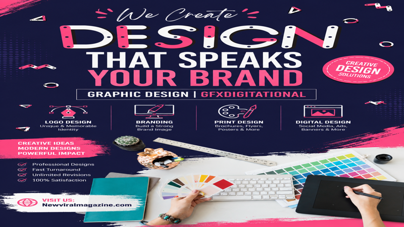
Posters remain one of the most effective visual communication tools in graphic design. Whether you’re promoting an event, advertising a product, spreading a message, or building brand awareness, a well-designed poster can grab attention in seconds. If you’ve been searching for how to design a poster — graphic design tips from GFX Digital — this guide walks you through the creative thinking and practical steps behind a poster that actually works, from defining your purpose to picking the right software. Poster design isn’t just about placing text and images on a page. A successful poster blends strategy, layout, color, typography, and audience understanding into one clear visual message. It should tell viewers what they need to know instantly and give them a reason to act.
Why Poster Design Still Matters
Even in the age of social media and short-form content, posters haven’t lost their power. They’re visual, direct, and memorable — perfect for concerts, workshops, sales campaigns, awareness drives, school events, product launches, and more.
A poster has only a few seconds to make an impression. The best ones are simple, visually striking, and easy to read from a distance, using size, contrast, color, and spacing to guide the eye straight to what matters most.
Step 1: Define the Purpose
Before opening any design software, ask: What is this poster supposed to do?
Every strong poster starts with a clear goal. Are you selling something, promoting an event, announcing a service, or raising awareness? Your purpose shapes every decision that follows — the headline, the imagery, the color palette, and the call to action.
- An event poster needs the name, date, time, and location front and center.
- A business poster needs a strong identity and a persuasive offer.
- A social awareness poster often relies on emotional imagery and minimal text.
The clearer your message, the stronger your design.
Step 2: Know Your Audience
A poster aimed at teenagers will look nothing like one aimed at corporate clients — which is why audience research comes before any visual decisions.
Ask yourself:
- What age group will see this?
- What visual style appeals to them?
- What tone and language will resonate quickly?
- Will they see it online or in a physical space?
A younger, creative audience often responds to bold colors and experimental type. A professional audience usually responds better to a cleaner layout with restrained colors.
Step 3: Choose the Right Size and Format
Print posters need high resolution and the correct dimensions for their final size, so text stays sharp and images don’t pixelate.
Digital posters — for Instagram, Facebook, websites, or digital billboards — depend more on screen-friendly color and the right aspect ratio for each platform.
Either way, start with high-quality source images; low resolution is one of the fastest ways to undermine an otherwise good design.
Step 4: Build a Strong Layout
Layout is the skeleton that organizes everything else — text, images, icons, shapes, and space. A good layout tells the viewer what the poster is about, where to look first, and what to do next.
Use a grid. It keeps elements aligned and creates visual consistency, even if viewers never consciously notice it.
Leave white space. One of the most common beginner mistakes is filling every inch of the page. Empty space isn’t wasted space — it separates information and makes the poster easier to scan.
Create a clear flow. The eye should move naturally from headline to supporting details to call to action. If the layout feels chaotic, people stop reading.
Step 5: Use Readable Typography
You can have great colors and visuals, but if the text is hard to read, the poster fails.
- Headline — the largest, boldest element; it should communicate the core message instantly.
- Subheadings — break content into digestible sections.
- Body text — keep it short. Posters aren’t built for paragraphs; include only what’s essential.
Sans-serif fonts tend to hold up best at a distance and in large-format layouts. A simple rule that rarely fails: one bold font for headings, one clean font for everything else.
Step 6: Choose Colors with Intent
Color can make or break a poster’s effectiveness:
- Bright contrast for energy and urgency
- Soft tones for elegance and calm
- Brand colors for consistency
- Strong light/dark contrast for readability
A focused palette creates clarity; too many competing colors weaken the message. Avoid low-contrast combinations like light text on a light background — your message should be legible at a glance.
Step 7: Use High-Quality Images
Images are often the first thing people notice, so low-quality visuals damage the whole design immediately. Choose imagery that reinforces your message rather than just decorating the page:
- Product posters need clean, sharp product photography
- Event posters benefit from energetic, dynamic visuals
- Awareness posters need emotionally relevant imagery
- Brand posters need a consistent visual style
Use original or properly licensed high-resolution images, and avoid anything stretched, pixelated, or unrelated to the message.
Step 8: Build Visual Hierarchy
Visual hierarchy means showing viewers what matters most, first. You can build it using:
- Font size and boldness
- Color contrast
- Positioning and spacing
- Image scale
Typically, the title should stand out first, followed by the date, offer, or key message, and finally the call to action or contact details. Done well, hierarchy makes a poster feel effortless to read.
Step 9: Add a Clear Call to Action
A poster should do more than look good — it should prompt action. Keep your CTA short, direct, and visible: Register Now, Visit Our Website, Call Today, Shop the Sale, Join the Event. For marketing or business posters, this is often the single most important line on the page, since it’s what turns attention into a response.
Step 10: Pick the Right Tool
The right software depends on your skill level and project type:
- Canva — beginner-friendly, great for templates and social posters
- Adobe Express — fast, polished results with easy branding
- Adobe Illustrator — professional vector control, ideal for print-ready work
- Photoshop — best for image-heavy compositions and advanced editing
- Figma — strong for digital-first and collaborative workflows
The tool helps you execute — but design thinking is what actually makes the poster work.
Common Mistakes to Avoid
- Too much text — posters should be scannable, not read like an article
- Weak contrast — if text doesn’t stand out, people won’t read it
- Poor image quality — blurry visuals instantly lower perceived quality
- No clear focus — every poster needs one main message
- Too many fonts or colors — variety without restraint creates confusion
- Ignoring white space — crowded layouts feel unprofessional
Quick Checklist for a Better Poster
- Keep it simple and visually direct
- Make key information (titles, dates, offers) readable from a distance
- Include only essential content — not everything you know about the topic
- Design with the real viewing context in mind: a wall, a phone screen, a busy market, a social feed
Final Thoughts on How to Design a Poster (Graphic Design Guide by GFX Digital)
Great poster design isn’t about decoration — it’s about communication. It starts with a clear purpose, speaks directly to the right audience, uses readable typography, builds strong visual hierarchy, and balances imagery, color, and white space with intention. Whether you’re a complete beginner or an experienced designer, the most effective posters are almost always the simplest ones. In the end, strong poster design comes down to choosing the right elements with confidence — not adding more of them.